Tuesday, 4 May 2010

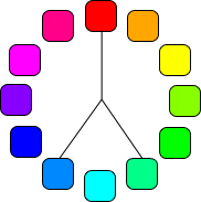
Triad colours


These are colours of which are three hues equidistant on the colour wheel. Preferred technique when looking for a colourful yet balanced website.

Split complimentary colour


This is the use of a colour, and the analogue colours of its complimentary colour. This technique can give a design with a level of contrast, yet not as high a level of contrast as the use of complimentary colours therefore resulting in greater harmony.

Complimentary colours


Complimentary colours are those of which are directly opposite each other on the colour wheel. They are contrasting and stand out against each other, so are often good as highlight colours as they stand out with an impact.

Analogue colours


Analogue colours are those of which lie next to each other on the colour wheel, often the colour schemes found in nature and so is automatically familiar to the audience. Can make a website seem harmonious.

Colour wheel


Useful in choosing an aestheticaly pleasing set of colours.

Use of colours

When creating my site it is very important that I consider what colours i use on the different pages and the logo of my site. Colour theory is the form of guidance as to which colours compliment each other when mixed and put together, and which do the opposite and make a colour scheme which isn't very aesthetically pleasing.

The first big thing to concentrate on is how many colours to use on your website. Research suggests that using fewer colours is far less risky than using lots, as this could mean the site would look too busy and may make it harder for the audience to navigate around the site and find the information they want.

In the decision of choosing a colour scheme for my website I could choose to look at a number of elements. A simple rule regarding colours can be followed to prevent displeasing colour schemes.

Primary colour, this is the main colour of the page and will set the tone of the website. It should stay consistent throughout the website and should cover most of the surface area of the pages.

Secondary colour, this is the second colour of the page and is in place to back up the primary colour. Will usually be a colour of which is pretty close to the primary colour.

Highlight colour, often used to emphasise parts of the page, so may be different and contrasting to the primary and secondary colours.

Logo research - nspcc


This is the final logo I am looking at, and once again it is very simple. This is to make sure that it has an impact and doesn't cloud the views of the charity and what they wish to achieve. Unlike the other logo's, it doesn't have a picture displaying a help for children, it has taken the opposite path in leaving a serious message with a large bold full stop, promoting the phrase below, that child cruelty must be stopped. Similarly to the other two logo's, it was found in the conventional place at the top left hand side of the page. This makes sure it is one of the first things of which the audience view when visiting the website, meaning it stays in the audiences head. It also shows minimal use of colours to keep it simple and meaningful.